
Pinterest Tips: Time to Pin for Mobile First

To hit the ground running on Pinterest in 2015, it may be time to shift your thinking. For many marketers (myself included) we thought we could pass the mobile viewers off as second class citizens. We told ourselves, “They can just zoom in on our pin if they can’t read the text.” or “They can just pinch and zoom on their smartphones once they get to my website.” Now with 75% of Pinterest activity occurring on mobile devices, you can no longer ignore the mobile audience and expect to succeed. You need to start thinking “mobile first.”
Mobile users will continue to grow in their use of Pinterest. Ahalogy reports that 28 percent of active users say they have pulled up pins on their mobile devices to guide in store purchases. Forty percent of moms active on Pinterest have pulled up pins on their mobile devices to guide in-store purchases and fifty-two percent of daily users have done so as well. If you are doing any sort of product marketing on Pinterest these numbers are staggering. You need to be making sure that your Pins are easy to read and navigate for those moms pushing a shopping cart around in the store!
Here are three Pinterest tips for optimizing pins for mobile:
1. Optimize your Limited Space
Text size is a key factor. If your title isn’t easy to read on a smartphone, chances are people will not click through to read your article. If it’s a product image, make sure that your product stands out. On a cluttered background your product can be lost on a smaller mobile screen. Remember, your image and the title of your content is competing with everything else streaming by in the Pinterest feed.
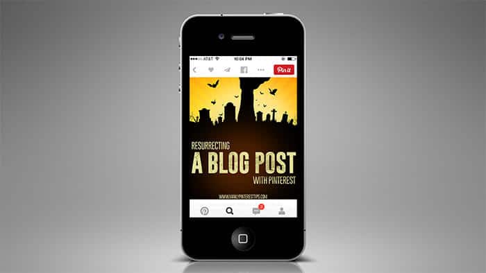
Here’s an example of one of my pins. I think that the image and title work well. However, I should have made the top and bottom of the title bigger so that it would be easier to read on a mobile device. I also should have made the website link on my graphic larger or tried a different font for better readability.
Rich Pins are more important than ever, especially on mobile devices. Rich Pins allow your blog title and icon to show up at the top of your image in a large font that is easy to read on mobile.
2. Your Top Two Pinterest Boards are the Most Important
When someone clicks on your profile to find out more about you, many times (depending on the device) your top two boards will be the only ones visible. You need to make sure that those top boards are the ones that most reflect your business or services.
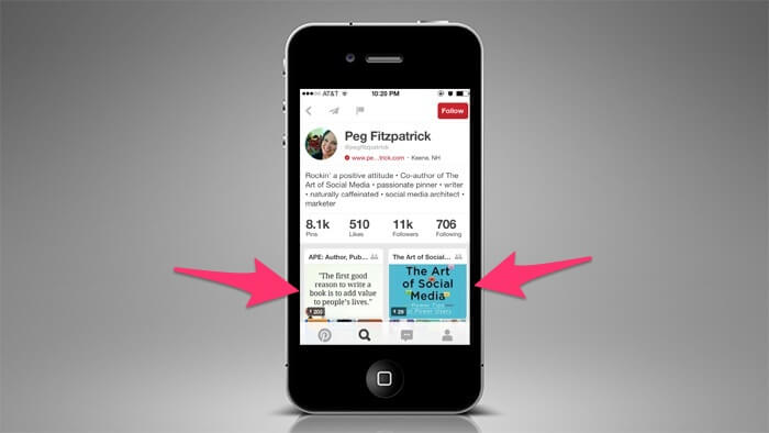
Pinterest makes it easy to rotate your boards, so don’t be afraid to rotate those top two boards out for holiday or seasonal boards if it makes sense for your company.
3. Optimize Pinterest Descriptions for Mobile
In the desktop version, Pinterest show up to 500 characters in the pin description. However, on mobile the number of characters displayed are usually 75-100 for iPhone and 100-125 for Android. Make sure that you are taking the time to craft your pin descriptions.
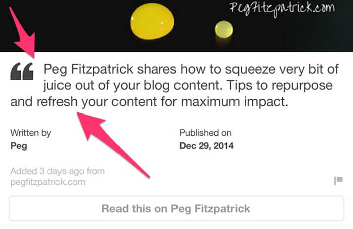
Another cool new feature for Rich Pins is the larger quote graphic that displays from your description field. This is a relatively new update to the mobile app so you may need to update the app on your device if you can’t see this feature.
Bonus Tip: Watch Those Infographics!
We all love infographics on Pinterest. However, make sure that you can read those easily on a mobile device. Many times, even if you click on the link to view the image larger, the text is way too small to read on a mobile device. Keep the mobile end-user in mind when creating or even sharing infographics on Pinterest.
As we kick off the new year, now is a great time to re-visit your Pinterest account and make sure that your pins are optimized for your mobile visitor. Test out pins on different devices to see what might need adjusting. Make sure that you take a look at your account page as well. You really want those top two boards to shine! The year 2015 is the time to think “Mobile First!”

Wise words from the First Gentleman of Pinterest.
Mobile first is a strategy that anyone who does anything on the web should be following – so it’s a really good reminder that Pinterest graphics (not just descriptions) need to be included in that. Do you know of any good tools that can help visualize what a given pin might look like on the different types of mobile devices?
As for infographics – holy cow, there are some with text so tiny that I can’t read them on a desktop with my resolution cranked up to the max… mobile would be a completely lost cause for those! So yeah, choose a program with a mobile interface to get a better idea of how an infographic will display.
Great read, Jeff & Peg!
Hi Krista!
Great questions! I always check things on my phone so I’m not sure if there’s some other way to test them.
Infographics can be really hard to read – I agree! Thanks for reading and commenting!
Hey Krystal – glad it gave you some food for thought!
PINTEREST itself needs to consider MOBILE. I no longer use a PC for the internet but now use a 10″ TABLET! Neither the PINTEREST APP nor the Browser allow you to arrange your PINTEREST BOARDS!
So while I find PINTEREST interesting I find it much lacking in functionality for Mobile!
Useful post!
Sometimes when I follow an infographic pin to the original site, the picture is nowere to be seen, even if it is the right article. How do they do that? I find it very usable when tall pictures doesn’t fit so good into my design for the site.